
Sunday, December 30, 2012
Saturday, December 22, 2012
FARRELL BRICKHOUSE: INTERVIEW
 | |
|
 |
| Mast I- Wind for the Sail Solid Air, 2012, oil on canvas, approx. 12 x 8 inches |
 |
| Struggle #5- Dancing Bear, 2009, oil on canvas, 18 x 18 inches |
 |
| New World Type 1, 2012, oil on canvas, 14 x 11 inches |
 |
| Painter's Form Again, 2011, oil on canvas, 16 x 12 inches |
The tangibility of paint and a certain loose-handedness with the brush
are the prominent traits found in the work of Farrell Brickhouse. There’s the
sense that each painting is strived for, worked out …hard won. But not only is
he contending with paint in the painterly tradition, Brickhouse is also dealing
with the enchanting qualities that his pieces exude; it’s as if he’s imbuing
his subjects with lightness and grace. It’s that aspect of his work that has me
hooked, not just how the paint appears. In trying to pin down the specific
quality that I’ve felt, I want to use the word “charming,” but another part of
me says that I should embrace terms like: captivating, beguiling and
mesmerizing when trying to assess the thoughts and feelings that his works
induce.
PB: What I like about your work is the paint handling, coupled
with a color usage that’s wide open—the same things I appreciate in the work of
Soutine and Avery. Can you tell me a bit about your influences?
FB: I greatly appreciate the
effort you've put in to become familiar with my work and I think you've made
perceptive observations of what is important to me, especially about achieving
grace in my painting. A fellow artist used the term "tertiary palette"
in describing recent work of mine. I liked that. Influences are many as they
are for most of us. First, I remember as a child, going to the Museum of
Natural History in NYC and seeing those dioramas, these worlds cast in a dark
corridor—each one opening on something "mesmerizing," to quote you.
I've sought that in my work, each painting is to be this illuminated world/object.
Soutine did that with this gritty light and those jewel-like moments that come
out of paint being pushed into paint. There was that great group show awhile
back at Cheim & Read of Soutine and
His Influences. Georges Rouault’s Christ
Before Pilate - 7.25 x 5.2 inches is just sublime. At Queens College,
Charles Cajori was a wonderful instructor to me.
As a young man, my friend Ralph Hilton and I were roped together, sort of
to say, working on each other's paintings and sharing what it was to live the
life of an artist. There was something so exciting about what two can do next
to a solitary painter. Also, spending several years fishing off Montauk in the
late 70’s before deciding to return to NYC and give it another shot …Joseph
Conrad said, “If you would know the age of the Earth, look upon the sea in a
storm.” As I matured, art history offered different lessons and my influences
would sound like the usual suspects.
There are also the early paintings of Eva Hesse, the humanity of early
Greek and Roman frescoes and also African American vernacular art mostly seen in
a book called Souls Grown Deep.
Influences are also those that confirm one is on the right path, not
necessarily something one is drawing from formally, but as a territory worth
inhabiting—someone like early Peter Saul. And NYC in the 70’s was quite a
unique world and the city still is such an influence, this vibrant community of
artists making such a passionate commitment to a life in the arts …one had
better make the best thing possible. Of course, traveling a bit and seeing
something of the world excited and expanded my art.
PB: The specific way in which you work—which feels like an
exploration with paint—is evident. Can you shed some light on your studio
practice and your experiences there?
FB: I was about to quote myself
here but then thought better of it. When one has worked so hard to craft a
document that is accurate about such an illusory process, there is the
temptation to repeat it. Yes, at best it is certainly an exploration and I like
your distinction between practice and experience. One question I ask when
entering the studio is, “what needs to be said, what can my art contain?”
My studio time is not unique, it runs the whole gamut: from the workman-like
strokes that one makes until something more significant can happen, to the
terrible certainty that it is all collapsing and one should just buy a boat and
be done with it. There are the moments when I come alive; the marks seem
determined, as if they always existed, and I am witnessing the process unfold—and
all that one knows seems to be available in this illuminated moment. One also
learns when to stop and step out of the trenches and look for a while to see
what has been achieved, especially after the novelty wears off. Sometimes it’s
a way forward that’s been rendered and sometimes one is rewarded with a decent
work.
My practice is one of having multiple paintings going at once. I may
focus on just one thing, but usually there is this leapfrogging going on, where
one work liberates the other to take the next step. I’m often amazed at how a
casual three-minute sketch on a small piece of paper can inform a painting. I
putter around and I have lots of visual sources lying about, as well as my own
drawings, gouaches and such. I’m very organized, but in the immortal words of
Patti Smith, “one has to lose control to gain control.”
PB: You’re on the faculty at SVA (School of Visual Art). How do
you approach teaching?
FB: SVA has provided me with a wonderful place to
work. I’ve been there since 1980 in the Undergraduate Fine Arts Department.
Teaching is about being a conduit for the student, to provide a route to him-
or herself. We offer a safe place for them to learn and to fail and make what
they need to make at this time in their emerging careers. We endeavor to turn
them into Students worthy of the name. I offer them my passion, my knowledge of
how to work, the belief that art is a language, that the function of language
is to allow us to speak, and that art comes from a life lived.
Students learn
when they realize that the tools we are offering will enable them to get to
where it is they want to be. It happens on all fronts, the entire expanse of
being an artist—and faculty members can be an example that it can be done, that
a life in the arts is possible. It’s such a privilege to share one’s hard won
experience and be in a dialogue with young people, to be relevant. It is a
vibrant part of my life and informs my own practice. We are all eternally
students if we are artists.
PB:
Who are some other artists whose work you’re excited about right now?
FB: There is the beloved Kathy
Bradford… I believe there are synchronicities in the air, shared stories and
images born of what it is to be alive now and that her work is terrific. Jennifer
Wynne Reeves makes me feel like a barbarian, in a good way. Peter Acheson,
Peter Gallo… so many younger artists are excited about paint, what it allows
and what it can speak to and that is encouraging. My Facebook community is
really rewarding. I know I am leaving out many fellow travelers. I like what
John Yau is writing about too.
PB: What other things out there fuel your work and progression?
FB: I am not sure about “out there.” At this
point in my life there seems to be a turning inward, a focusing on my work that
keeps unfolding and a censorship on what I let in, even as I feel more
connected than at any time in quite awhile. The miracle of a life with my wife—my
muse, the upstate NY land we go to as a sanctuary… traveling and seeing the
courage that people all over the world display in seeking justice makes me
believe my task is to be as courageous as possible in the studio. I do want to
see what the scope of my art can speak to: personal experiences, current events
and history.
Recently, I feel that good work is somewhat like a time machine. It
opens up one’s past body of work to new interpretations and significance, and
allows one to claim new territory for the future. My career has been up and down and then
some. With the new technology of sharing and a turn in the currents, I have
another run going. I feel painting now is crisscrossing old borders with
passion, wisdom and abandon to make work that resonates. Our political,
financial, religious and even scientific leadership has mostly failed us at
this moment in history. I think the re-emergence of painting today is tied to
the need to create our own mythologies and to document the depth of wonder at the terrible beauty of this existence. Thanks Mike.
Saturday, December 15, 2012
KATY MORAN
 |
| Clown Navigation, 2012, acrylic, paper, collage on board, 56 x 44 cm / 22 1/8 x 17 3/8 in |
 |
| Rooms of the Mind, 2009, acrylic and collage on canvas, 49.5 x 38.7 cm / 19.5 x 15.2 in |
Sunday, December 9, 2012
Saturday, December 8, 2012
JIM & GYAN SHROSBREE AT MAHARISHI UNIVERSITY OF MANAGEMENT
 |
| Jim Shrosbree |
 |
| Jim Shrosbree |
 |
| Jim Shrosbree |
 |
| side view |
 |
| Jim Shrosbree |
 |
| detail view |
 |
| Gyan Shrosbree |
 |
| Gyan Shrosbree |
Saturday, December 1, 2012
SUZAN FRECON
 |
| version 13, 2010, oil on linen, 2 panels. overall: 108 x 87 3/8 inches (274.3 x 221.9 cm). each panel: 54 x 87 3/8 inches (137.2 x 221.9 cm), FRESU0057 |
Saturday, November 24, 2012
Wednesday, November 21, 2012

Saturday, November 17, 2012
JILLIAN KAY ROSS
 |
| 2-1D (after RM), 2012, acrylic on canvas, 18 x 24 inches |
 |
| f864111G, 2011, acrylic on canvas, 18 x 24 inches |
 |
| 2-1E, 2012, acrylic on canvas, 18 x 24 inches |
Saturday, November 10, 2012
JIM LEE: INTERVIEW
 |
| Behind the Drapes, Under the Draft, 2012, acrylic on canvas with plywood and staples, 27 x 21 x 6 1/2 inches |
 |
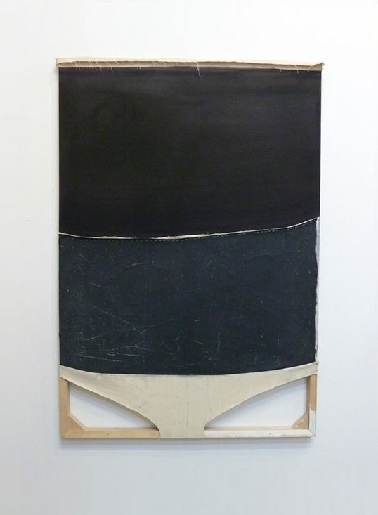
| Untitled (Black Bottom, White), 2009, oil and vinyl on paper mounted on insulation foam and wood, 24 x 18 x 4 inches |
 |
| Untitled (Upper Guston), 2008, acrylic on canvas over wood with staples, 9 x 7 x 2 1/2 inches |
 | |
|
 |
| Untitled (Crawlspace II), 2011, oil and acrylic on canvas dropcloth with staples and wood, 66 x 44 inches |
 |
| Studio |
 |
| Studio |
Every time I go to a gallery or museum, I always take a look
at the sides of paintings, and if possible, maybe I’ll see hanging threads,
parts of stretchers or even the back. My hope is to see more, to see what else
went into the construction — not just what’s on the canvas, but what truly supports
the canvas. So it appears I have a curiosity about things and their making.
The work of Jim Lee satisfies all of my inquiries in one
glance. The first time I saw his paintings, I caught sight of a painter who
values all of the materials at hand. And it’s a very singular way with the
stuff of painting that Jim has. There’s a fusion of irreverence and bliss.
Irreverence as scaffolding and staples are sometimes brought around from the back of the
work to the front — and a knowing, calming feeling of bliss from the
realization that something great has been done with the most basic of
materials.
PB:
Some of your paintings involve intricate and unique support structures while
others are more traditional and planar. What considerations go into the making
of both types of work?
JL: I’m not sure if I make a distinction with my paintings. For me, it’s just about working with my materials and trying to understand how to transition from one to the next, incorporating the physical vs. the visual. Whether its pieces of wood, a slice of linen, graphite marks, oil, latex paints, rubber, aluminum, I try to be open and not get caught up with prescribed hierarchies. I don’t want to have limitations when I work—I want more possibilities. But to try and answer your question, I suppose my work comes from a variety of enthusiasms. One being, that I’m very curious about how paintings and objects relate to the space in which they exist. How they connect with the physical space and how that promotes interaction with the viewer. As an individual, I bounce around in my social mannerisms. Sometimes I’m very outgoing while other times I desire quiet peaceful moments. I have to assume that my painting follows similar traits. Sometimes I’m quite social and out front, other times I’m more subdued and reticent. I’m a Libra and perhaps my work is created depending upon my mood at that time.
JL: I’m not sure if I make a distinction with my paintings. For me, it’s just about working with my materials and trying to understand how to transition from one to the next, incorporating the physical vs. the visual. Whether its pieces of wood, a slice of linen, graphite marks, oil, latex paints, rubber, aluminum, I try to be open and not get caught up with prescribed hierarchies. I don’t want to have limitations when I work—I want more possibilities. But to try and answer your question, I suppose my work comes from a variety of enthusiasms. One being, that I’m very curious about how paintings and objects relate to the space in which they exist. How they connect with the physical space and how that promotes interaction with the viewer. As an individual, I bounce around in my social mannerisms. Sometimes I’m very outgoing while other times I desire quiet peaceful moments. I have to assume that my painting follows similar traits. Sometimes I’m quite social and out front, other times I’m more subdued and reticent. I’m a Libra and perhaps my work is created depending upon my mood at that time.
PB:
Some of your titles such as, Upper Guston,
have art historical references. Others like, A Stone Ginger and Chop Tank,
come from other sources. Can you tell me more about your titles and how they
have specific meaning to you?
JL: That’s funny. Folks seem to like my titles. For me, they are an extension, a way to allow more information to pass thru the painting, a way for the painting to connect with the viewer—at the same time being somewhat elusive. I remember when I made Upper Guston. It was a Friday night in August, 2008 and I was on Long Island. I had been working on the painting for a few weeks but nothing was really happening with it...so as usual, I just set it aside and started on something else. But that Friday night was different. I was working (the thinking and the doing were as one) and I got lost in the process. I was engaged in the painting and I never felt the need to step back from the painting to “have a look” – I stayed in it. I don’t know how long I was working because when this occurs I lose track of things, minutes become hours, etc. Anyway, I finally felt the painting was just hanging on—barely a pulse—so I stepped away and I was sorta startled by the final image. It looked familiar but in a very odd way. I thought of Philip Guston and decided to go to the bar. So to make a short story long, I guess the name just arrived through process.
JL: That’s funny. Folks seem to like my titles. For me, they are an extension, a way to allow more information to pass thru the painting, a way for the painting to connect with the viewer—at the same time being somewhat elusive. I remember when I made Upper Guston. It was a Friday night in August, 2008 and I was on Long Island. I had been working on the painting for a few weeks but nothing was really happening with it...so as usual, I just set it aside and started on something else. But that Friday night was different. I was working (the thinking and the doing were as one) and I got lost in the process. I was engaged in the painting and I never felt the need to step back from the painting to “have a look” – I stayed in it. I don’t know how long I was working because when this occurs I lose track of things, minutes become hours, etc. Anyway, I finally felt the painting was just hanging on—barely a pulse—so I stepped away and I was sorta startled by the final image. It looked familiar but in a very odd way. I thought of Philip Guston and decided to go to the bar. So to make a short story long, I guess the name just arrived through process.
My titles can’t be forced. If I don’t have a title that just seems obvious to me the painting will get the “Untitled“ with a parenthetical descriptor. I reference all sorts of stuff. Mostly sports, music, mapping, phrasing and fables. Chop Tank is the name of a river in Maryland and A Stone Ginger was the name of a race horse. So I pull from all over the place.
PB: What also interests me is the possible range of influences on your work. Who are some of the artists—past and current—whose work you find significant?
JL: I’d say my influences run all over the place, from Titian to the everyday basement craftsmen. I’m easily blown away by the lighting in a Goya painting yet also enamored with the gas cap of a ’64 Pontiac. In terms of significant artists, I mean there are too many to name. The brutal elegance of Marlene Dumas, John McCracken and his shiny slabs, Ellsworth Kelly, Newman’s Onement, Palermo—the list goes on, but when someone asks me who my favorite artist is...I always say Gordon Matta Clark. I know my work has nothing to do with his but I just love the generosity that I feel in his work and can only hope that my work could generate a response that powerful in someone else.
PB: Are there other mediums that you have also worked in or plan to work in as an extension of your current practice?
JL: I’m just a painter. I don’t think that I’m smart enough to do much else; although, I would like to add a sound element at some point in time. But that seems a long way off.
PB: What’s in your top ten (essential books, music, quotes, etc.)?
JL: Cool, I like lists.
10. The
Hanover Merzbau -- I was about 17 years old and I discovered Schwitters. He was
the first artist that gave my visuals validity.
9. Bleedinggreennation.com -- I’ve been an Eagles fan since about 1978 (all Philly sports for what it’s worth). I check this site at least 6 times a day.
8. Bruce Nauman -- His mannerisms are fantastic; using limited tools to promote unconventional ways to solve issues in the studio.
7. Innies.
6. Sargent’s Madam X -- I wish the strap was still off her shoulder.
5. True Crime Novels -- Blood and Money is one of my faves.
4. Blue States, thanks Iowa.
3. Audio Random Repeat function -- I’ll listen to The Stooges, T.V. Eye for 12 hours straight...it gets weird after about 7...by the end, I feel what I imagine a hostage situation to be like.
2. Brussels -- all the great people and the disjointed architecture reminds me of Brooklyn and the Midpoint Cafe is my spot....It’s my Brussels version of the Montero.
1. Maisy Jaymes -- my 4 month old daughter is simply the coolest thing I’ve had a hand in making.
Saturday, November 3, 2012
REBECCA MORRIS
 |
Untitled (#01-10), 2010, oil and spray paint on canvas, 84 x 72
inches
The more I look at this work, the more I think. A flipping back and forth between foreground and background, room for contingency to happen, and a very open yet right-on color sensibility typify the paintings of Rebecca Morris. The particular way she nuances the picture plane with a variety of paint application is the factor that intrigues me though; thick and thin, brushed and sprayed -- both possess equal weight. I find myself wandering through her compositions, checking the relationship and the opposition between the elements that comprise them. The best part of her whole enterprise is the fact that these paintings force the eye to work a little before their emotional impact is felt.
|
harrislieberman.com and In The Make
Friday, November 2, 2012
DAVID OSTROWSKI
,+2012,+acrylic,+lacquer,+adhesive+foil+and+cotton+on+canvas,+wood,+87+x+67.3+in+(221+x+171+cm).jpg) |
| F (Jung, Brutal, Gutausehend), 2012 acrylic, lacquer, adhesive foil and cotton on canvas, wood 87 x 67.3 in (221 x 171 cm) |
ltdlosangeles.com
Saturday, October 27, 2012

Friday, October 19, 2012
MARIA WALKER: INTERVIEW
 |
| Untitled (Stand), 2011, acrylic, unprimed canvas, wood, 61.25" x 28" x 5.75" |
Altered stretcher bars, torqued and
triangulated planes, backs as fronts—the work of Maria Walker is a lesson in harmonizing
tradition and experimentation. But the path she’s taken hasn’t been an easy
one. She has pushed her materials and flowed with them in order to elicit a distinctive
sense of aesthetic truth. Many of her paintings involve dense soakings of
pigment while others have a reworking of the stretchers that gives them the
ability to stand on their own without being wall-mounted. A few pieces involve
no canvas at all, which obviously changes how they’re approached and perceived.
Through all this exploration, there’s a sense of sureness that surrounds what I
consider challenging and thoughtful work. In the interview that follows, Maria
offers concise insights into her working philosophy and the work itself.
 |
| Summer - Summer Solstice, 2011-12, acrylic, unprimed canvas, wood, 65.5" x 49" |
 |
| Return, 2011-12, wood, 42" x 22" |
.jpg) |
| Untitled (Orange and Blue), 2011, acrylic, unprimed canvas, wood, 16" x 14.25" x 4.5" |
 | |
|
 |
| Bow (front view), 2011, acrylic, unprimed canvas, wood, 59" x 25" x 2.25″ |
 |
| Studio |
PB: Your work struck me as entertaining questions of image and object. What’s your personal take on it?
MW: I approach my paintings as objects. I think of the wood, the canvas, and the paint in terms of their physicality, and I work to find a balance of these elements through my interaction with them. Images in the work arise as a visualization of this exploration. When a painting is successful or good, the image is integrated as an essential, necessary aspect of the object. The danger is when/if I indulge too much in the image aesthetically, making choices that take the painting away from its physical being. By closely considering the wood (the stretcher), the cloth (the canvas), and the paint, each element keeps the other two in check, questioning and verifying the necessity, directness, and clarity of each part.
PB: As you’ve looked around through recent and longstanding art history, whose work has made an impact on you?
MW: Two people specifically stick out in my mind. The first is Matisse, in particular the complex balance between lightness and rigor in his work. His paintings breathe with color, air, space, and joy, but as an artist he worked for each painting. There is honesty in his paintings, at times failure, but always pushing forward, very brave and open. He is one of the artists I remember first seeing as a child. His cutouts made clear sense to my child mind. In grad school, looking at his paintings helped me face and embrace the very difficult growing pains of pushing open my work.
Second, I think of Donald Judd at the Chinati Foundation in Marfa, Texas. I went to Marfa with my graduate school class, and to see that work in the context of the vast, empty Texas landscape blew my mind. I grew up in the flatness of Ohio, so I was really excited to see artwork that met that landscape so directly. Seeing his work helped me think about space, directness, and scale in my own. There were bells and whistles I could shed that allowed the work to step forward with more clarity.
PB: What challenges and considerations have you run into because of the experimental nature of working with canvas in this way?
MW: I work with the unprimed canvas because when the paint soaks into the cloth it becomes a part of it, part of the object itself, rather then sitting on top of the surface. Unprimed canvas is a challenge because it is not protected in the way that it would be with traditional oil paintings. So I take pains to keep it protected and clean (which is difficult in a small studio with a saw!). But these are objects, and eventual accumulation of wear may become visible, and that will become part of what it is. If it is a good painting, that shouldn’t matter.
PB: Have you found yourself thinking more about the canvas and its needs rather than just the pigment and what it’s doing?
MW: I think about the canvas as much as the paint as much as the wood. It comes back to that balance amongst the three materials. There is a large range of what canvas is—weight and weave, linen, drop cloth, cotton, wool. Each has its own color, weight, and density thereby responding to the wood and the paint in its own, specific way. The same goes for the wood and the paint. Different kinds of wood have different colors and weights and densities. Different paints have different translucencies, viscosities, respond differently to water, surface, and each other.
PB: Does music or historical figures and cultural situations/problems ever figure into your work?
MW: I rarely make work based on these things, though they may peripherally affect the energy in the studio. I’m more likely to figure in the element of time, whether it is a particular time of year (which affects decisions about color and light), or more objectively working with the idea of documenting time in the paintings. The second idea manifests in the calendar paintings; these document a specific period of time in the studio, usually using as a basis a stretcher divided into twelfths (as in a clock or a calendar). In the spaces of the clock, I pour the leftover paints from other paintings as I’m making them. The calendar paintings become an inventory of the other work concurrently made in the studio, and also a visualized document of the specific time frame.
PB: What’s on your reading/looking/listening radar lately?
MW: I am nearing the end of “Within A Budding Grove”, which is the second book of Proust’s In Search of Lost Time. I love it! The book is seven books long, well over thousands of pages, so the scale of the experience of reading it is very different than any kind of reading experience. It is immersive and reflective, the language physical and descriptive… It recreates the experience of living while standing outside of that experience.
Also on my radar is my work as an art therapist. I work with adolescent kids with severe mental illnesses. It is hard, exciting work that keeps me aware of humanity and my trust in art making. It is a great antidote to the cynicism that can come with the art world.
PB: Any advice?
MW: The advice I repeatedly give myself is to find my own clear sense of time. It is easy to be waylaid especially by the speeds of technology and the art world.
I also say to myself: See, see, see lots of art!
And: If there is a painting you want to make, make it.