Saturday, November 24, 2012
Wednesday, November 21, 2012

Saturday, November 17, 2012
JILLIAN KAY ROSS
 |
| 2-1D (after RM), 2012, acrylic on canvas, 18 x 24 inches |
 |
| f864111G, 2011, acrylic on canvas, 18 x 24 inches |
 |
| 2-1E, 2012, acrylic on canvas, 18 x 24 inches |
Saturday, November 10, 2012
JIM LEE: INTERVIEW
 |
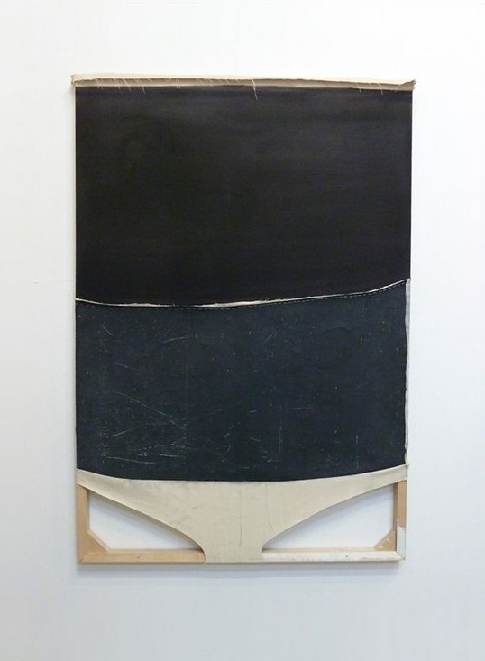
| Behind the Drapes, Under the Draft, 2012, acrylic on canvas with plywood and staples, 27 x 21 x 6 1/2 inches |
 |
| Untitled (Black Bottom, White), 2009, oil and vinyl on paper mounted on insulation foam and wood, 24 x 18 x 4 inches |
 |
| Untitled (Upper Guston), 2008, acrylic on canvas over wood with staples, 9 x 7 x 2 1/2 inches |
 | |
|
 |
| Untitled (Crawlspace II), 2011, oil and acrylic on canvas dropcloth with staples and wood, 66 x 44 inches |
 |
| Studio |
 |
| Studio |
Every time I go to a gallery or museum, I always take a look
at the sides of paintings, and if possible, maybe I’ll see hanging threads,
parts of stretchers or even the back. My hope is to see more, to see what else
went into the construction — not just what’s on the canvas, but what truly supports
the canvas. So it appears I have a curiosity about things and their making.
The work of Jim Lee satisfies all of my inquiries in one
glance. The first time I saw his paintings, I caught sight of a painter who
values all of the materials at hand. And it’s a very singular way with the
stuff of painting that Jim has. There’s a fusion of irreverence and bliss.
Irreverence as scaffolding and staples are sometimes brought around from the back of the
work to the front — and a knowing, calming feeling of bliss from the
realization that something great has been done with the most basic of
materials.
PB:
Some of your paintings involve intricate and unique support structures while
others are more traditional and planar. What considerations go into the making
of both types of work?
JL: I’m not sure if I make a distinction with my paintings. For me, it’s just about working with my materials and trying to understand how to transition from one to the next, incorporating the physical vs. the visual. Whether its pieces of wood, a slice of linen, graphite marks, oil, latex paints, rubber, aluminum, I try to be open and not get caught up with prescribed hierarchies. I don’t want to have limitations when I work—I want more possibilities. But to try and answer your question, I suppose my work comes from a variety of enthusiasms. One being, that I’m very curious about how paintings and objects relate to the space in which they exist. How they connect with the physical space and how that promotes interaction with the viewer. As an individual, I bounce around in my social mannerisms. Sometimes I’m very outgoing while other times I desire quiet peaceful moments. I have to assume that my painting follows similar traits. Sometimes I’m quite social and out front, other times I’m more subdued and reticent. I’m a Libra and perhaps my work is created depending upon my mood at that time.
JL: I’m not sure if I make a distinction with my paintings. For me, it’s just about working with my materials and trying to understand how to transition from one to the next, incorporating the physical vs. the visual. Whether its pieces of wood, a slice of linen, graphite marks, oil, latex paints, rubber, aluminum, I try to be open and not get caught up with prescribed hierarchies. I don’t want to have limitations when I work—I want more possibilities. But to try and answer your question, I suppose my work comes from a variety of enthusiasms. One being, that I’m very curious about how paintings and objects relate to the space in which they exist. How they connect with the physical space and how that promotes interaction with the viewer. As an individual, I bounce around in my social mannerisms. Sometimes I’m very outgoing while other times I desire quiet peaceful moments. I have to assume that my painting follows similar traits. Sometimes I’m quite social and out front, other times I’m more subdued and reticent. I’m a Libra and perhaps my work is created depending upon my mood at that time.
PB:
Some of your titles such as, Upper Guston,
have art historical references. Others like, A Stone Ginger and Chop Tank,
come from other sources. Can you tell me more about your titles and how they
have specific meaning to you?
JL: That’s funny. Folks seem to like my titles. For me, they are an extension, a way to allow more information to pass thru the painting, a way for the painting to connect with the viewer—at the same time being somewhat elusive. I remember when I made Upper Guston. It was a Friday night in August, 2008 and I was on Long Island. I had been working on the painting for a few weeks but nothing was really happening with it...so as usual, I just set it aside and started on something else. But that Friday night was different. I was working (the thinking and the doing were as one) and I got lost in the process. I was engaged in the painting and I never felt the need to step back from the painting to “have a look” – I stayed in it. I don’t know how long I was working because when this occurs I lose track of things, minutes become hours, etc. Anyway, I finally felt the painting was just hanging on—barely a pulse—so I stepped away and I was sorta startled by the final image. It looked familiar but in a very odd way. I thought of Philip Guston and decided to go to the bar. So to make a short story long, I guess the name just arrived through process.
JL: That’s funny. Folks seem to like my titles. For me, they are an extension, a way to allow more information to pass thru the painting, a way for the painting to connect with the viewer—at the same time being somewhat elusive. I remember when I made Upper Guston. It was a Friday night in August, 2008 and I was on Long Island. I had been working on the painting for a few weeks but nothing was really happening with it...so as usual, I just set it aside and started on something else. But that Friday night was different. I was working (the thinking and the doing were as one) and I got lost in the process. I was engaged in the painting and I never felt the need to step back from the painting to “have a look” – I stayed in it. I don’t know how long I was working because when this occurs I lose track of things, minutes become hours, etc. Anyway, I finally felt the painting was just hanging on—barely a pulse—so I stepped away and I was sorta startled by the final image. It looked familiar but in a very odd way. I thought of Philip Guston and decided to go to the bar. So to make a short story long, I guess the name just arrived through process.
My titles can’t be forced. If I don’t have a title that just seems obvious to me the painting will get the “Untitled“ with a parenthetical descriptor. I reference all sorts of stuff. Mostly sports, music, mapping, phrasing and fables. Chop Tank is the name of a river in Maryland and A Stone Ginger was the name of a race horse. So I pull from all over the place.
PB: What also interests me is the possible range of influences on your work. Who are some of the artists—past and current—whose work you find significant?
JL: I’d say my influences run all over the place, from Titian to the everyday basement craftsmen. I’m easily blown away by the lighting in a Goya painting yet also enamored with the gas cap of a ’64 Pontiac. In terms of significant artists, I mean there are too many to name. The brutal elegance of Marlene Dumas, John McCracken and his shiny slabs, Ellsworth Kelly, Newman’s Onement, Palermo—the list goes on, but when someone asks me who my favorite artist is...I always say Gordon Matta Clark. I know my work has nothing to do with his but I just love the generosity that I feel in his work and can only hope that my work could generate a response that powerful in someone else.
PB: Are there other mediums that you have also worked in or plan to work in as an extension of your current practice?
JL: I’m just a painter. I don’t think that I’m smart enough to do much else; although, I would like to add a sound element at some point in time. But that seems a long way off.
PB: What’s in your top ten (essential books, music, quotes, etc.)?
JL: Cool, I like lists.
10. The
Hanover Merzbau -- I was about 17 years old and I discovered Schwitters. He was
the first artist that gave my visuals validity.
9. Bleedinggreennation.com -- I’ve been an Eagles fan since about 1978 (all Philly sports for what it’s worth). I check this site at least 6 times a day.
8. Bruce Nauman -- His mannerisms are fantastic; using limited tools to promote unconventional ways to solve issues in the studio.
7. Innies.
6. Sargent’s Madam X -- I wish the strap was still off her shoulder.
5. True Crime Novels -- Blood and Money is one of my faves.
4. Blue States, thanks Iowa.
3. Audio Random Repeat function -- I’ll listen to The Stooges, T.V. Eye for 12 hours straight...it gets weird after about 7...by the end, I feel what I imagine a hostage situation to be like.
2. Brussels -- all the great people and the disjointed architecture reminds me of Brooklyn and the Midpoint Cafe is my spot....It’s my Brussels version of the Montero.
1. Maisy Jaymes -- my 4 month old daughter is simply the coolest thing I’ve had a hand in making.
Saturday, November 3, 2012
REBECCA MORRIS
 |
Untitled (#01-10), 2010, oil and spray paint on canvas, 84 x 72
inches
The more I look at this work, the more I think. A flipping back and forth between foreground and background, room for contingency to happen, and a very open yet right-on color sensibility typify the paintings of Rebecca Morris. The particular way she nuances the picture plane with a variety of paint application is the factor that intrigues me though; thick and thin, brushed and sprayed -- both possess equal weight. I find myself wandering through her compositions, checking the relationship and the opposition between the elements that comprise them. The best part of her whole enterprise is the fact that these paintings force the eye to work a little before their emotional impact is felt.
|
harrislieberman.com and In The Make
Friday, November 2, 2012
DAVID OSTROWSKI
,+2012,+acrylic,+lacquer,+adhesive+foil+and+cotton+on+canvas,+wood,+87+x+67.3+in+(221+x+171+cm).jpg) |
| F (Jung, Brutal, Gutausehend), 2012 acrylic, lacquer, adhesive foil and cotton on canvas, wood 87 x 67.3 in (221 x 171 cm) |
ltdlosangeles.com
Subscribe to:
Posts (Atom)

